




Description
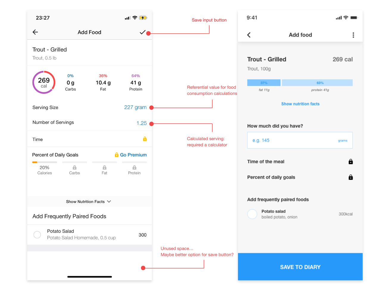
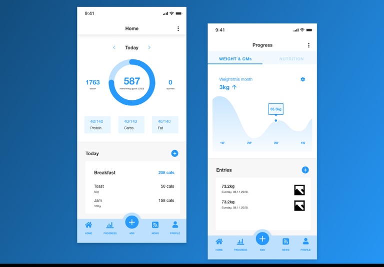
MyFitnessPal 9 December 2020 MyFitnessPal application review MyFitnessPal is considered a leading calorie counter and nutrition tracking app. It revolves around setting simple goals and keeping a record of food consumption, while also enabling users to visualise progress through a progressive timeline that displays information such as calorie and macronutrient averages against goals. Process: 1. User research/usability testing 2. Identifying challenges and setting goals 3. Overview of the current implementation 4. Solution ideation (description/wireframing) 5. High-fidelity design proposition 6. Conclusion User research/usability testing: • Setting up goals and using the app daily for a streak of 3 days • Reading recent user reviews from App Store, Play Store, Trustpilot, and YouTube • Interview 5 users of the app to identify features they like/dislike, have troubles using or use most often Findings: • 4/5 interviewed users claim that calculating portion size takes too long since each food has its own, often different, predefined serving size ======================================== Challenges: Goals: • 5/5 users find that the primary screen is filled with blog posts and advertisements, which is not the primary reason they use the app (this is in keeping with most of the negative reviews) • 4/5 users report that all UI components look very similar to each other • 3/5 users state that it is difficult to find all the features they use (e.g. progress against goals, macronutrients breakdown, also in line with negative user reviews written this year) • 0/5 users use the app for blogging/sharing photos of progress or their daily meals with friends Reported bugs: this is more of a technical thing, but one of the users interviewed was a returning user, who was unable to log in or reset the password, just getting the message that the server was unable to log him in. Moreover, he could not finish the "create account" process either. The error messages stated only that the "unknown error" occurred, which did not provide enough direction and made him think of switching to another application. Another user reported that clicking “Explore premium” or “Go premium” buttons brings an empty white screen only. Challenges: Based on the user research phase, one can distinguish a few main challenges: • Too many features and lack of prioritisation based on user needs • Profile-related information (e.g. exercise and nutrition goals, physical measures and progress tracking) are dispersed among multiple screens (e.g. diary, progress, and "more" menu) • Flow for adding food is rather cumbersome since it requires searching for edibles and calculating portion size based on app's proposed serving size (this requires recalculating units of measurement and using a calculator for finding out the respective proportion) • Outdated user interface cluttered with secondary features (can be labelled as "unfriendly" for novice users) Goals: 1. Clean up information hierarchy of the application ======================================== Analysis of the current state of the application 2. Improve access to critical information 3. Simplify the "adding food" user flow 4. Propose UI improvements for a more cutting-edge design Analysis of the current state of the application Taking into account topics found on MyFitnessPal forum, it is arguable that the intended core features include setting goals for weight loss, maintenance, or gain and staying on track with eating and workout habits. Seeing success stories from other users should motivate one to adhere to the app, and recipes and workout routines are additional features that make MyFitnessPal an all-in-one solution should one seek inspiration and health tips. However, the way current information architecture is laid out, essential features seem to be in the shadow of secondary ones, and crucial data is not always prominent enough/easy to navigate to. The following sections will give a brief overview of the screens currently reachable from the main navigation. Home screen The current home screen of the mobile application is comprised of the top bar with the overview of today's caloric intake, and the scrollable feed of blog posts, recipes, user's activities and (depending on the payment plan) advertisements. ======================================== Pain points: summary of calories is the most critical element of this page, suggestions however, Pain points: summary of calories is the most critical element of this page, however, due to the featured blog posts images, it is not noticeable at first sight; challenge suggestions have a "close" button making them resemble advertisements all too much. Diary This screen houses primary app features, such as tracking food consumption. It consists of the same daily summary element that is found in the home screen, paired with Breakfast, Lunch, Dinner, Snacks and Water intake breakdown for the day. Pain points: time-consuming adding process; the call to action button seems to be "Complete diary" which gives feedback regarding the progress when clicked, however, the tracking can resume after engaging in this activity either way. Progress This page focuses on a reporting dashboard that highlights how goal-related data changes over time (e.g. weight, steps). ======================================== Pain points: measurements incorporate steps, weight, neck, waist and only hips on (although desktop), I Pain points: measurements incorporate steps, weight, neck, waist and hips (although I have not been able to find the latter three in the profile settings on mobile, only on desktop), and lack goals connected to macros (nutrition reports are to be found in the settings). Goals are located in the settings as well, even though they are closely linked to the "Progress". More "More" seems to be the menu for navigating the rest of the features. It includes profile, goals, nutrition, blog, community, recipes, workouts and many more. Pain points: this menu holds ~20 links, which are not grouped based on the features they represent, nor are reachable from other parts of the app, even though some of them (e.g. goals, nutrition) are an integral part of the "Progress" and present crucial elements for a seamless user experience. ======================================== Solution proposition Solution proposition Before starting the wireframing phase, it is necessary to redefine the information architecture and regroup features so that the most important ones become easily accessible. To achieve this, I first identified the four key aspects to be reachable from the main navigation: diary, progress, profile, and feed (including recipes and workouts). Settings and notifications can be moved to the top navigation. New navigation would consist of: 1. Home: daily snapshot (of calories and exercise) + the diary. 2. Progress: a screen enhanced to include both measurements and macros goals 3. Add: remains the same 4. Feed: blog posts, recipes, and notifications about users' achievements/progress 5. Profile: page that combines personal information, current measurements and goal settings, that will dictate the data visualised in the progress tab The change in the home section should provide an efficient way for users to access important data and provide their inputs. The progress screen should keep track of all goals, and not only a subset of them for easier navigation. The same applies for profile page and settings. As far as the feed is concerned, the social features can be kept, however placing them in a place other than "Home" allows them to stay secondary and not clutter the interface. ======================================== The set of wireframes is meant for better conveying new ways for accessing critical data Wireframing The set of wireframes is meant for better conveying new ways for accessing critical data within the app, as well as portraying how new navigation would work, and what each screen would encapsulate. They are meant to describe the user flow and the change in the information architecture, without giving away details of actual UI implementation. Firstly, the home screen should facilitate a complete snapshot of today: including caloric intake and breakdown of macros, and it is also the place where one would initiate "Add food" process. The feed is a bit simplified and contains the category of the post, title, excerpt and how long ago it was posted (some of this information can be displayed on top of featured media). The progress screen is set to combine nutrition and measurement goals through additional navigation on top, and the view (e.g. timeframe and measurement selection) settings. Still, the way settings are organised should be tested further as having a separate menu for each parameter might be more convenient for users. When it comes to adding food, one solution for simplifying it (and removing the need for calculator) is to standardise the way user states how much he/she had, no matter the food. That would require the calories always to be displayed based on 100g portions (or whatever unit the user set for his/her profile). The users would only write down the size of the portion they have had in the unit which is relevant to them, as proposed in the following wireframes. ======================================== Moreover, bar charts might be more convenient for showcasing the macros, brief as the data Moreover, bar charts might be more convenient for showcasing the macros, as the data stands out more, and the layout seems less cluttered. The next image provides a brief comparison. ======================================== UI redesign concept UI redesign concept This section aims to showcase one of the directions possible for the UI overhaul. The goal was to keep the brand's colours and font choice, but update the colour scheme with some secondary options, as well as propose a more modern appeal for the UI components. The UI design needs to follow overall information architecture and contain all data present in the wireframes, however, the way components will actually look and feel is left for the UI design phase. In this case, I played with boxes, gradients and shadows to give a more modern appeal. The feed is also altered based on the wireframe, but some post categories slightly differ from the rest: that is the case with challenge posts which include a call to action button. ======================================== Conclusion Conclusion MyFitnessPal can remain one of the leading calorie trackers but has room for improving both the user interface and user experience. These would include restructuring the information architecture so that alike features are grouped together, and making sure that features users consider essential make their way to screens reachable from the main navigation. Furthermore, it is advisable to take advantage of multiple colours when redesigning the UI component library, as that would enable users to use the software more efficiently, as well as allow the application owners to lead the users towards completing desired business goals. As far as social aspects are concerned, they should be retaught: users primarily download the app for tracking calories, and some reviews point out that sharing the progress or caloric intake would invade their privacy. Those who want to share usually end up using Instagram for that (this was also shared in some of the reviews), as they can reach a wider audience and probably already have a base of followers. 10 ======================================== Regarding generating more conversions, apart from solving technical made “premium”. errors, it would All be Regarding generating more conversions, apart from solving technical errors, it would be interesting to see if some parts of the progress reporting tool can be made “premium”. All core features are available for free, and while that is a great value for users, it might be all they are looking for - which is not in line with the business goals. Since a vast majority of them signs up for calories and goals tracking, these are the aspects that might need revised separation between free and paid items. 11
Offering Summary
- Asking Price$111,111
Documents
Property Address
Property Details
- Property TypeOffice
Deal Team